Wednesday, February 8, 2012

the beautiful side of rain

Clouds reflect off the mirrored surface of Lake Eyre SA, by Peter Elfes

It was announced this week that Australia has had its wettest two years on record.

Again large areas of Queensland and New South Wales are currently under water with many towns and communities cut off. In the 13 months the rain at its worse has caused many loss of life, devastation to property and disruptions to thousands of peoples lives.

Brisbane floods 2011
(source University of Queensland, Brisbane)  

The rain at its best, is showing a beautiful side with dramatic changes to the landscape.

One particular landscape is a desert, usually and unsurprisingly known for its dryness. La Nina has brought water flowing, filling the lowest point in Australia, Lake Eyre. 

With the rarity of the lake having so much water comes a wonderful array of colours, erupting with life and breathtaking landscapes on a very large scale.  To give you an idea of size, at its fullest the lake is 9,500km2  which is roughly 6 times the size of Greater London.

This unusual event has inspired new art.

John Olsen, a great Australian artist takes inspiration for many of his pieces from the Australian landscape, in particular he has been fascinated by Lake Eyre since his first visit in 1974.  His latest series of Lake Eyre paintings captures the landscape, viewing it in such a unique way, that continues to fill me with awe.  The collection can be viewed on the Tim Olsen Gallery website

source Tim Olsen Gallery


Currently exhibiting in Sydney is Peter Elfes collection of photographs taken at low levels from a helicopter. Life and colour is captured in a place normally barren of such features

A selection of postcards showing Peter Elfes 'The Green Desert'
Enjoy the beautiful side of rain.  'The Green Desert' is on until 27 May 2012 at Custom House, Circular Quay Sydney (free entry M-F 10am- 7pm, weekend 11am-4pm).

Monday, January 30, 2012

are you playing it safe with white?

Whether you are redecorating, extending or building a new house it is exciting yet at the same time very daunting choosing the colours for everything from the floor to the ceiling and everything in-between.  Faced with all the choices it is easy to opt for white, after all it is the safe choice.  Isn't it?  

Lets have a look at some of the reasons given for choosing white and why it is not always the best choice.
a few subtle variations of white
   
white is simple
White is not just pure white.  There are many subtle variations that may show hints of colour, that will be difficult to see unless applied to a large area.  Just like with colours there are combinations that work and those that don't.

white = bigger + brighter
Whilst this can be true for some rooms, for instance, applying it to a room with little natural light can look dirty.  Applying some colour would be a better choice.  
On Robben Island the lime quarry mined by Nelson Mandela and his fellow inmates, with their back to the sun the harsh rays reflected against the dazzling white lime.  The glare meant the inmates squinted their eyes during the day and then took a long time to adjust to the lower light in their cells (Nelson Mandela: Long Walk to Freedom).  Choosing a white that is too light can be hard on the eyes just like the lime quarry.
  
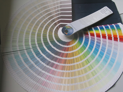
these are just some of the colours in the full Dulux range
indecision
In Australia, Dulux make it easier for you by only showing around 1500 of their colours in places like Bunnings, when the full range from Dulux is nearer to the 5000 mark.  And that is just one paint company. Even if you manage to eliminate your least favourite colour you are still left with hundreds, if not thousands of colours to choose from.  No wonder it so difficult to make a final decision when you don't what direction to take, that you give up and look at the smaller range of whites.
safe choice
Maybe you are thinking of being bold with a colour but remain unsure, so you ask a friend or a family member what they think.  Doing this there is the strong likelihood you will receive a negative comment. You start doubting yourself, start considering other colours, become confused which one to go with.  Then you decide that white is going to be the safe choice.  
Would it not be best to choose a scheme that makes you happy, after all it is you that lives in your house, not your friend. Also, unlike your friend/ family member I can give you the whys of a colour scheme so you can have the confidence that they are the right selections for you and your home.
which white best suits your home?
could it be yellow white, grey white, pinkish white?

white won't date
Many will think that white will always look good, that it won't date.  One colour by itself will have a harder time to look dated, it is the combination of colours, the materials used, style of fixtures and fittings that are all guilty together of dating a space.  Again just like colours there are some whites that look more yesterday than today.
white adds more to resale value
Many real estate agents will advice you to keep it neutral to avoid offending any potential buyer.  I say, what do they know about colour?  Applied well colour can be used to highlight features, add character and probably more importantly, in a tough selling market, stand out (for all the right reasons) from the crowd.
Most reference have been to paint colour, as this is where the widest selection of colours are available, however the principles applies to any kind of material or furnishings applied in your home.  You now have plenty of reasons why white is not always the safe or best choice, so go on be bold choose some colour.  If you are still feeling daunted, you will benefit from a colour consultation.  If you are on North Shore of Sydney contact me at enquiries@decoroci.com.au

Wednesday, January 11, 2012

inspiration: william morris

I can be a detailed person which is probably one of the reasons why I am drawn so much to the intricate work of William Morris.

1884 Wandle design from Iain Zaczek book 'William Morris'
An earlier post, inspiration: my back yard showed the inspiration and part of the creative development that forms the backdrop design of this blog.
Using a different technique to draw the same flower: drawing the flower without taking the pencil off the paper, and without looking at the paper. After enlarging the illustration and taking the outline of the pencil lines, you will see the results are very different.
© decoro creativity 2012
This was developed further with an influence from William Morris Wandle design for textile to create another illustration.

© decoro creativity 2012
 
Let the right side of mind be creative and you can explore so many avenues that it can be easy to get carried away. The difficulty is when you should listen to the left side of the brain of when to stop.

"Half of art is knowing when to stop"
Arthur W.Radford

Sunday, January 1, 2012

Why does the same colour look so different?

I spent the last few years studying colour indepth - and what a journey!

I have always been intrigued about colour, how (or not) to combine them and where etc. I could judge if a colour scheme applied to a room looked good or not, but was lost when it came to the starting point of deciding which colours to use and where. (I will cover why we can judge, but find applying difficult in a later post)

Canon 550d - Pencil Colour

One place we apply and change colour often, is through paint on the walls of our homes.
  • How is it that the same paint colour in my friends lounge looks so different in my bedroom?
  • Why does the paint I have just spent ages applying to my walls, does not look like the paint sample in the paint company's brochure or the chips I pick up the the hardware store?
  • I have not changed the colour or even the brand of paint, so why is it so different?

I discovered that the colour we see, is so much more than just the pigments that are in that tin of paint. Colour is far more complex than I could have ever thought and is so much more fascinating (well at least to me) than I could have imagined.

So OK, you have a colour. A bit of blue, a good dose of yellow, along with a large helping of white and black, and there maybe even a hint of red (even though you can't see it) thrown in for good measure. It might look a bit like this (or does it?)

What you see is not what I see: You see a picture on your computer monitor, I see a sample. Amazingly, it is the same sample in all three images.

The sample is true to the real paint. The scanned image and pictures by the camera sees the sample different to how the eye sees it. Your monitor and how you have it set up again changes how it looks. We are looking at the same thing but what you see is not what I see.

What I see on my monitor is a scanned image that has pink not seen in the sample. The photos (taken at different areas in the same room with slightly different camera settings) shows the image a lot greyer and darker than the sample. If you like the colours you see in the images and you paint your wall the colour used for those images you will end up a totally different result.

So the issues of me trying to show you a colour aside. The first major obstacle being able to detect the colour 'ingredients' of the colour to be applied? Isn't that it?

Nope, that is just the starting point.

In addition to the pigments in the tin, two other major players in how a colour appears are light and surrounding colours. Back to my friends lounge versus my bedroom: When I have been to their house it has been during the day and the room is lit with natural light. I go to bed after sunset and up before sunrise, so I am not in the room when natural light illuminates the bedroom. These two different sources of light affects the way we see the same colour. So that is the first reason it looks so different.

Hers is a lounge, mine is bedroom: the furniture is different, the colour and textures of the floor are different, the placement of the furnishings are different, the proportions of all the other colours in the room that is not the wall paint colour are different. All these differences add up to another reason the same colour on her walls looks so different to mine. The surrounding colours and the proportions they are in will effect how the same wall paint looks.

'windswept' sculptures by the sea, bondi 2011
the yellow looks more intense with the strong daylight and contrasted against the blue sky

If this was not enough to throw you off course, there are the brochures the paint companies produce:
1) Often printed, thus not an accurate representation of the true colour (to an untrained eye they may look the same).

2) You pick a colour from the brochure that is surrounded by other colours in the range - unwittingly you will pick up hues in the surrounding colours that will not be there surrounding your chosen colour in the room you paint, making your chosen paint looks different in reality to the brochure.

3) The brochure shows a 25mm by 25mm of the colour, and your wall is how big? They don't compare! Even for the expert it can be difficult to pick up the complexities of the colour 'ingredients' on such a small sample, so it is no wonder the sample you choose looks so different when it surrounds you in your room. One reason the paint companies push for you to try paint samples, and how many do you buy before choosing which one to use?

We feel we know so much about colour we feel we ought to be able to choose them ourselves, but many it is daunting just looking at all the thousands of paint colours that are out there, let alone what colour tile, floor, furniture selection to make.

Knowing more about colour shows that using an expert in colour whom will know a scheme that works for you before the tins of paint are bought, save you time, save money on sample pots, maybe avoid a few arguments with your partner, I'm sure more people will realise the benefits of hiring expert colour advice.

I have touched on few areas that are considered when a colour scheme is being created, with so much more to come.

Welcome to 2012 wonderful year of colour.