I spent the last few years studying colour indepth - and what a journey!
I have always been intrigued about colour, how (or not) to combine them and where etc. I could judge if a colour scheme applied to a room looked good or not, but was lost when it came to the starting point of deciding which colours to use and where. (I will cover why we can judge, but find applying difficult in a later post)
One place we apply and change colour often, is through paint on the walls of our homes.
- How is it that the same paint colour in my friends lounge looks so different in my bedroom?
- Why does the paint I have just spent ages applying to my walls, does not look like the paint sample in the paint company's brochure or the chips I pick up the the hardware store?
- I have not changed the colour or even the brand of paint, so why is it so different?
I discovered that the colour we see, is so much more than just the pigments that are in that tin of paint. Colour is far more complex than I could have ever thought and is so much more fascinating (well at least to me) than I could have imagined.
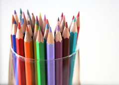
So OK, you have a colour. A bit of blue, a good dose of yellow, along with a large helping of white and black, and there maybe even a hint of red (even though you can't see it) thrown in for good measure. It might look a bit like this (or does it?)
 What you see is not what I see: You see a picture on your computer monitor, I see a sample. Amazingly, it is the same sample in all three images.
The sample is true to the real paint. The scanned image and pictures by the camera sees the sample different to how the eye sees it. Your monitor and how you have it set up again changes how it looks. We are looking at the same thing but what you see is not what I see.
What I see on my monitor is a scanned image that has pink not seen in the sample. The photos (taken at different areas in the same room with slightly different camera settings) shows the image a lot greyer and darker than the sample. If you like the colours you see in the images and you paint your wall the colour used for those images you will end up a totally different result.
So the issues of me trying to show you a colour aside. The first major obstacle being able to detect the colour 'ingredients' of the colour to be applied? Isn't that it?
Nope, that is just the starting point.
In addition to the pigments in the tin, two other major players in how a colour appears are light and surrounding colours. Back to my friends lounge versus my bedroom: When I have been to their house it has been during the day and the room is lit with natural light. I go to bed after sunset and up before sunrise, so I am not in the room when natural light illuminates the bedroom. These two different sources of light affects the way we see the same colour. So that is the first reason it looks so different.
Hers is a lounge, mine is bedroom: the furniture is different, the colour and textures of the floor are different, the placement of the furnishings are different, the proportions of all the other colours in the room that is not the wall paint colour are different. All these differences add up to another reason the same colour on her walls looks so different to mine. The surrounding colours and the proportions they are in will effect how the same wall paint looks.
 |
| 'windswept' sculptures by the sea, bondi 2011 the yellow looks more intense with the strong daylight and contrasted against the blue sky |
If this was not enough to throw you off course, there are the brochures the paint companies produce:
1) Often printed, thus not an accurate representation of the true colour (to an untrained eye they may look the same).
2) You pick a colour from the brochure that is surrounded by other colours in the range - unwittingly you will pick up hues in the surrounding colours that will not be there surrounding your chosen colour in the room you paint, making your chosen paint looks different in reality to the brochure.
3) The brochure shows a 25mm by 25mm of the colour, and your wall is how big? They don't compare! Even for the expert it can be difficult to pick up the complexities of the colour 'ingredients' on such a small sample, so it is no wonder the sample you choose looks so different when it surrounds you in your room. One reason the paint companies push for you to try paint samples, and how many do you buy before choosing which one to use?
We feel we know so much about colour we feel we ought to be able to choose them ourselves, but many it is daunting just looking at all the thousands of paint colours that are out there, let alone what colour tile, floor, furniture selection to make.
Knowing more about colour shows that using an expert in colour whom will know a scheme that works for you before the tins of paint are bought, save you time, save money on sample pots, maybe avoid a few arguments with your partner, I'm sure more people will realise the benefits of hiring expert colour advice.
I have touched on few areas that are considered when a colour scheme is being created, with so much more to come.
Welcome to 2012 wonderful year of colour.
No comments:
Post a Comment